Debt-to-Asset Ratio, the 1980s, and the Problem
The debt-to-asset ratio is often cited when discussing the 1980s farm financial crisis and considering if current conditions are worrying. Given its popularity, it’s worth reviewing what we can learn from the ratio, the 1980s, and how it might apply in the future.
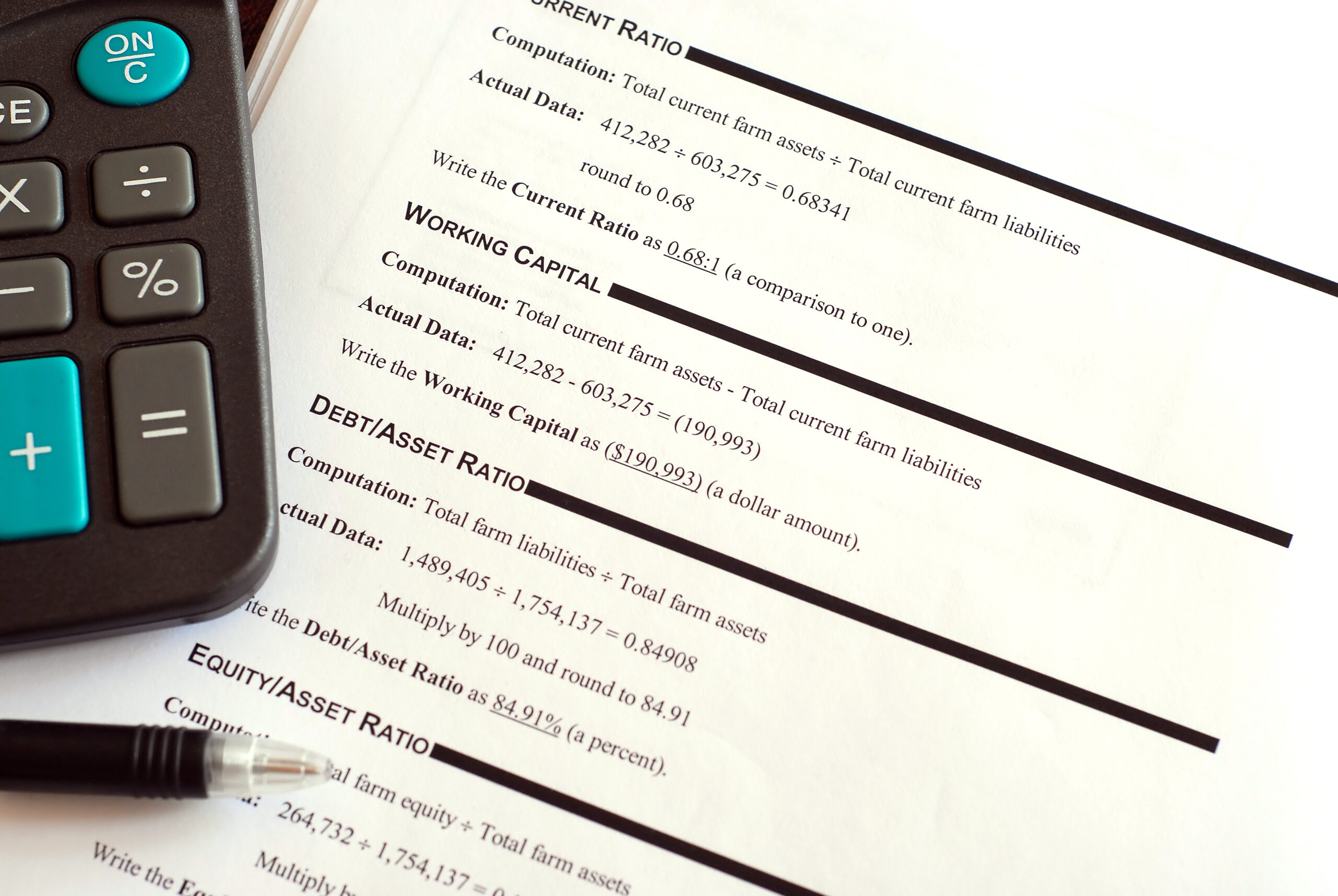
Debt-to-Asset Ratio
Figure 1 shows the debt-to-asset ratio across the U.S. farm sector since 1960. Throughout the late 1960s and 1970s, debts were just 17% of assets. However, conditions quickly changed. At 16.2% in 1980, the ratio wasn’t worrisome at the start of the decade. By 1982, the measure reached 19.1%, going from “average” to historically high in just two years. The ratio eventually peaked at 22.2% in 1985.
Throughout the 1990s, the ratio consistently hovered around 15%. Since 2000, the ratio has averaged just 13%. More recently, debts were 13.2% of assets in 2023 and at an all-time low of 11.3% in 2012.
Read more here about demographic differences.

Figure 1. U.S. Farm Sector Debt to Asset Ratio, 1960-2023. Data Source: USDA ERS.
The Problem: Debts or Assets?
The problem in the 1980s was too much debt, right? While a common conclusion, there is another possibility: too few assets. Remember that the debt-to-asset ratio is total debts divided by total assets, so the ratio will move higher if debts increase or assets fall.
Figure 2 shows debts and assets during the 1970s and 1980s. More specifically, both have been indexed to 1970 values to make relative changes more apparent. For example, assets and debts increased at roughly the same pace throughout the 1980s. If anything, assets slightly outpaced debts in the late 1970s. In 1981, however, these trends diverged.
After 1981, as the debt-to-asset ratio surged, 1.) asset values declined (largely out of producers’ control), and 2.) debts continued higher (perhaps as part of weathering the income shocks).
It’s the first factor – declining asset values – that often gets overlooked in the story of the soaring debt-to-asset ratio during that decade. From peak to trough, total assets decreased by 28%, and farmland alone fell by 31%. Furthermore, it wasn’t until 1985 that sector debt started to decline.

Figure 2. U.S. Farm Sector Assets and Debts, 1970 – 1989, nominal dollars. Data Source: USDA ERS and AEI.ag Calculations.
A Lagging Indicator?
In business and finance, the idea of leading or lagging indicators often comes up in pursuit of data or metrics to warn us of a brewing crisis. For example, there are data that can help forecasters issue a severe thunderstorm watch or warning – a leading indicator. Lagging indicators help us quantify and measure what happened, perhaps a rain gauge. These don’t necessarily replace each other, and both have different uses. So, where does the debt-to-asset ratio fit?
We’d argue that it’s perhaps a better lagging indicator, meaning it doesn’t tell us much about what the next few years have in store. Again, this is because conditions can change abruptly, especially if asset value falls. Just as you wouldn’t look at your rain gauge to see if a storm is coming, the debt-to-asset ratio doesn’t tell us if the farm economy will face challenges ahead.
Wrapping it Up
Digging into the components reveals that the debt-to-asset ratio soaring during the farm financial crisis was less about producers excessively adding debt (the numerator) and more about asset values rapidly collapsing (the denominator). Asset values are largely out of our control, and it can take several years to work debt lower, especially if incomes are limited. Stated differently, a farm’s balance sheet can quickly change even if debts are unchanged.
The Farm Financial Standards Council (FFSC) has the “vulnerable” label for ratios above 60%. A key lesson from the 1980s is that individual farms faced great financial stress as the ratio exceeded 20%.